
My Top 10 Photos: What Could Have Been Better (Part 2)
Welcome back! Last week we talked about photo critiques - how they help you learn and grow, and what they look like. We are “critiquing” my top 10 favorite photos that I’ve made, to give you an idea of what a photo critique might look like. Today we are continuing with the second half of my top 10, so let’s dive right in…

#6 Man walking in Bordeaux
I found this building to be fascinating - the juxtaposition of the ancient and the modern. So with a man on his cell phone walking past, it just added to the scene - to the story. The overcast sky gives it a certain ominous feel, but the man in the foreground has such a casual vibe - I guess another contrast, if you will.
This one I really liked from the beginning except for the white balance. Because it was a cloudy day, the color of the photo looked too yellow. Now white balance can be a pretty easy fix in Lightroom®…or it can be painful. This one was not easy. If the automatic doesn't work, there are a couple of options before trial and error come into play. Well after a LOT of trial an error, I finally got the color where I liked it.
Another point I want to make is that these are MY favorites. I don't know exactly why this made the list honestly. I have taken better photos. But there's something about it… If I asked Neal to choose his top 10, they would likely be 10 different ones than mine. So my point? I'm getting there… Your taste is your taste. Beauty is in the eye of the beholder. All of that. If you DO enter a critique situation, it's only for learning purposes. It can make you better. But if the judge doesn't like one of your photos, you are still allowed to like it. You can still include it in YOUR top 10.

#7 Midday Fountain in Bordeaux
This is another one that might not be a perfect photo in a lot of ways. But it evokes bright and sunny, energy, and it just makes me feel good when I look at it. I love the starburst effect of the sun, the backlit water spray... And the effect of the blurred water spray to emphasize the horse sculptures. Now one thing I found out AFTER I made this photo, is that f16 makes for the optimal starburst shape of the sun. Well I used f22. So I do wonder if my starburst would have been prettier - more defined with f16. I will certainly give that a try next time.
This is another one that I haven't really received a lot of "wow great shot" feedback on, but I love it anyway. Because I can.

#8 Boat Lined Canal in Annecy
This photo has actually gotten a lot of positive feedback. It was featured on Instagram by @IG_Worldclub and was liked by 100's. Yeah, it felt pretty freaking good! Up to that point, I was really making photos for me and didn't get much feedback from anybody. Well except my husband, of course. But I just kind of decided that I do it for myself - not rewards or praise. But let's face it, a little praise once in a while feels good!
With this photo, the line of colorful boats leads the eye right back to the bridge filled with people, the colorful trees, and finally the fall color tinged mountains in the background. And what else? Oh yeah…reflections. It’s got it all. Color, leading lines, reflections, balance. You can see why this one is on the list.
The only real negative about this one was that originally the reflections were present, but not evident - a little dull. And you KNOW how I like reflections! So with the help of magic Lightroom®, I gave them a little more pop. Et voilà! And if you are starting to wonder more about the magic of Lightroom®, yes I will be sharing some tips in a blog post soon. So stay tuned…
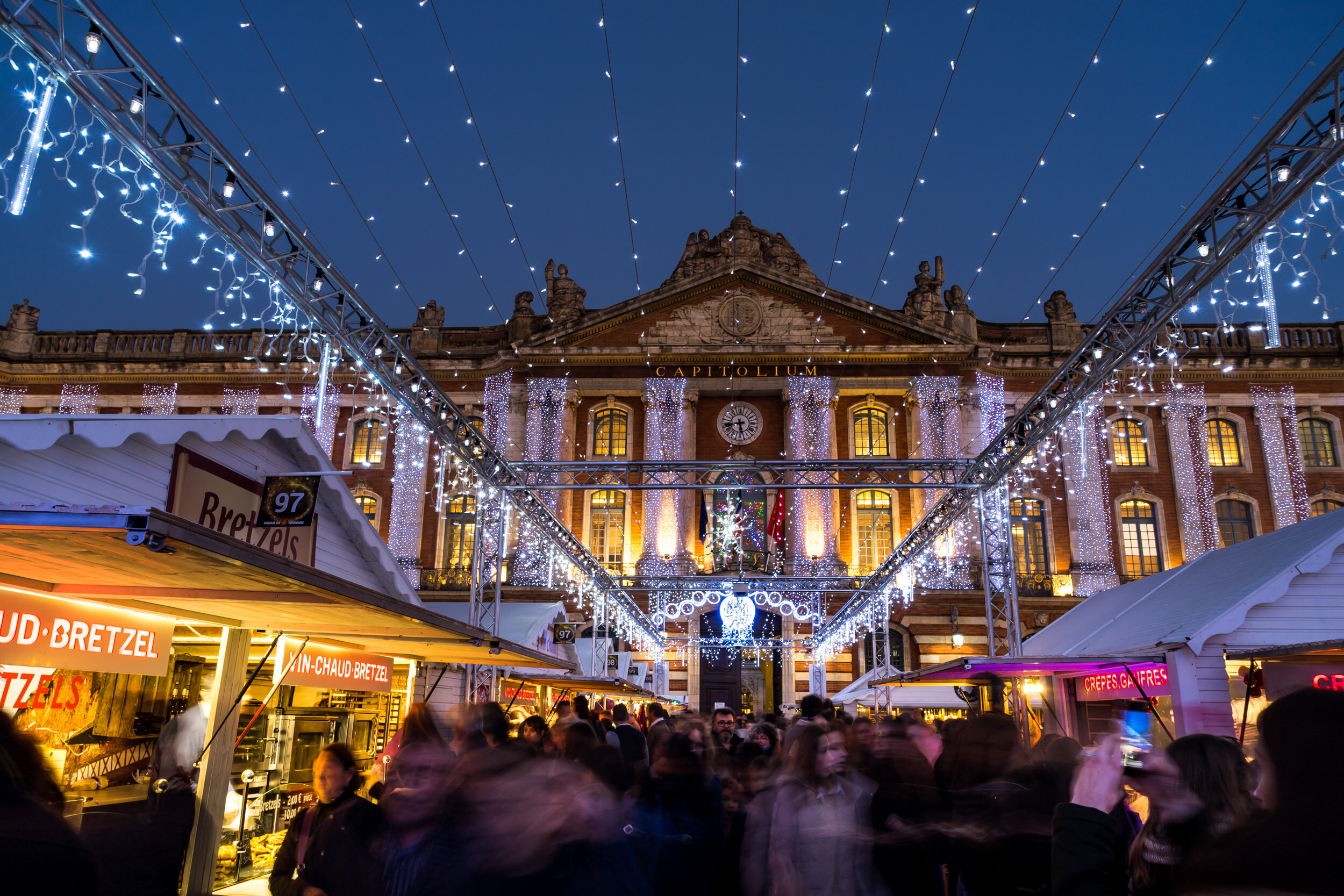
#9 Christmas in Toulouse
What I really love about this one is, of course, the deep blue color of the sky, contrasting with the neon lights of the booths, the sparkly lights…but also the blurred motion of people. This was intentional to show the energy of the event. It doesn't always turn out the way I'm envisioning, but this time it really did. I like the balance of the ancient building as the backdrop, with the lights connecting to the foreground of the people below, and the warm-lit booths.
Now one thing that really bothered me originally, and I still don't love, is the imbalance in the trusses (some help on that term from my husband) holding the lights. The left one ends in the corner of the photo, but the right one is a little off. No amount of cropping could fix it. So there are these beautiful leading lines of lights that don't quite balance. Another thing I've moved past, because I like the photo in general too much.

#10 Little Boy and Cat
This one definitely stands out from my other finalists. It is a photo made during my personal project at the Sacramento SPCA. This little boy was part of a birthday party that is hosted at the SPCA. I just love the interaction between him and the cat. It's the moment that wins the prize here. They both have an intent gaze at the other, and with his little hand reaching up to the glass…
But it's far from "perfect". When I initially saw this one on my computer screen I loved it. But then I immediately went to "damn the focus is off!" And if you look closely, the focus is actually on his head, rather than his face…or even his hand. Which is where I would prefer it to be. Those kids are fast-moving little suckers, and it's hard to get the focus fixed on exactly where you want it. But what I learned from Kirsten Lewis, and her critiques is that it's not the perfection of the shot, but the moment that makes it good. So this one was hard to include - because it's not "perfect". But I love the moment, so here it is.
Okay, here's your chance. Give me YOUR feedback. Which is your favorite, least favorite, what do you like, not like, wish had been better? Come on, I can take it. And if you want some feedback on your photos, you know where to get it…over in our Facebook Group. Don't worry, we're super nice there.